While I was sifting through a few hundred files trying to find a few templates I had lost in the
Great Deletion of 2010, I came across some elements that I created for some concept boards last year for work. While I use Illustrator on a daily basis, outside of some
miscellaneous free-hand drawings I don't do a lot of pen tool-based illustration in my own style. If you're not familiar with Illustrator, the pen tool is essentially a way to manipulate vector curves by hand, and usually looks a little something like this.
 |
| fun! |
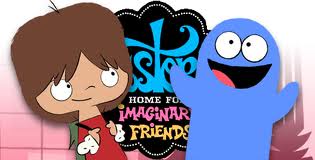
It's not nearly as intuitive as illustrating by hand but you do get a lot of control over each of your lines. I think its uses are intended more for design and industrial elements, so when it comes to trying to make something look cartoony with the pen tool you usually get something a bit more stiff than loose. Here's an example of some character work done with the help of Illustrator:
 |
| this show is quite good. |
Personally I think a lot of this style is like the new animé in the sense that you see it EVERYWHERE and 80% of it looks the same. With the advent and current widespread use of Flash, a vector-based animation program, this style isn't going away anytime soon -- plus it doesn't take a lot of illustration know-how to design some of the simpler characters. Like I was saying earlier, I took a stab at it last year and here are three quick Illustrator illustrations:
 |
| I don't hate them but they look too clean to me. |
Also if you're curious as to what the elements were made for, they were made for a pitch for this
J.C. Penney/Van Heusen football promotion. If you watch closely at the 5-second mark on the video embedded on the site, that was me making my national broadcast debut! You may also notice that none of the elements I worked on made it into the final product (although I did end up animating the whole thing).


No comments:
Post a Comment